Shopify Polaris for Everywhere
Role:
Illustration • Icons • Visual design
Team:
Meg Robichaud • Holly Schofield • Erin Moncrieff • Ryan Coleman
Tools:
Adobe Suite • Lingo • Github • Slack
Shopify’s product ecosystem was rapidly expanding. But as its capabilities grew, so did its complexity.
Entrepreneurs were intimidated by the idea of launching a new business and building on Shopify, or migrating their existing business to Shopify. There was so much to do and consider. It needed to feel more approachable.
Our goals for illustration across Shopify were:
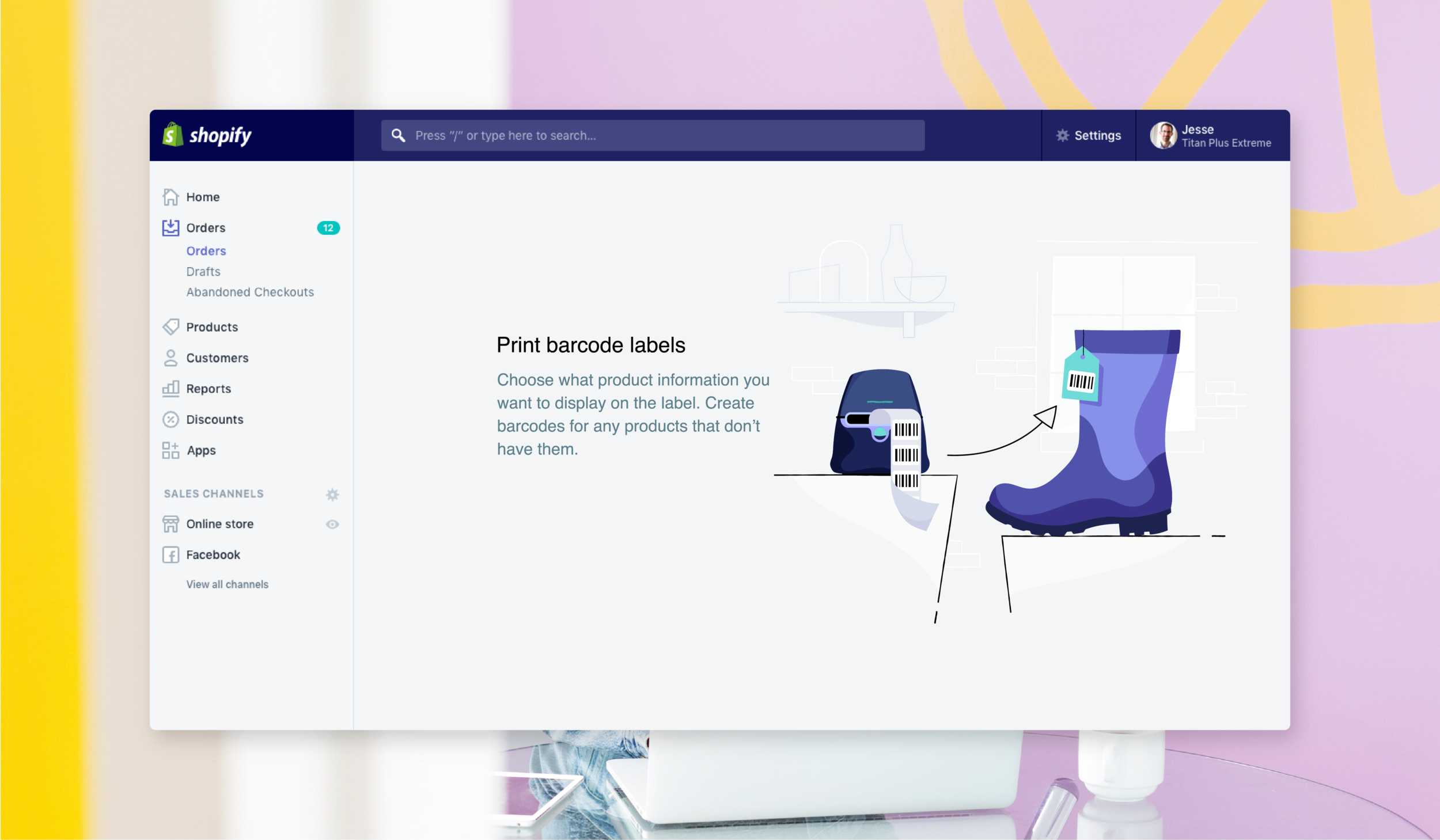
Make it feel human. Starting and running a business on Shopify needed to feel personal. Illustration could help it feel relatable and down to earth. We could communicate with merchants like real people, not like a machine.
Motivate with delight. Shopify experiences could serve to invigorate passion and excitement for the courageous process ahead. Running a business could be fun. We could bring joy to the process via the UI.
Be opinionated. There are real people making Shopify. It’s a living, breathing thing. We could connect with its merchants on a more intimate level by expressing humour and little bits of our actual personalities. We’re all in this together.
The mission
I joined the Illustration team after the illustration system was initially developed, and contributed to its ongoing expansion and evolution as a part of the Polaris design system.
We acted as a sort of blend of a creative service and product team. Our product was graphic communication across all of Shopify’s experiences (product, marketing, support, social, internal), and it was always ongoing. We’d jump onto product teams temporarily, build an understanding of their goals, help to establish a creative vision, develop illustrative/graphic assets, then jump off and onto the next project.
One style for everywhere
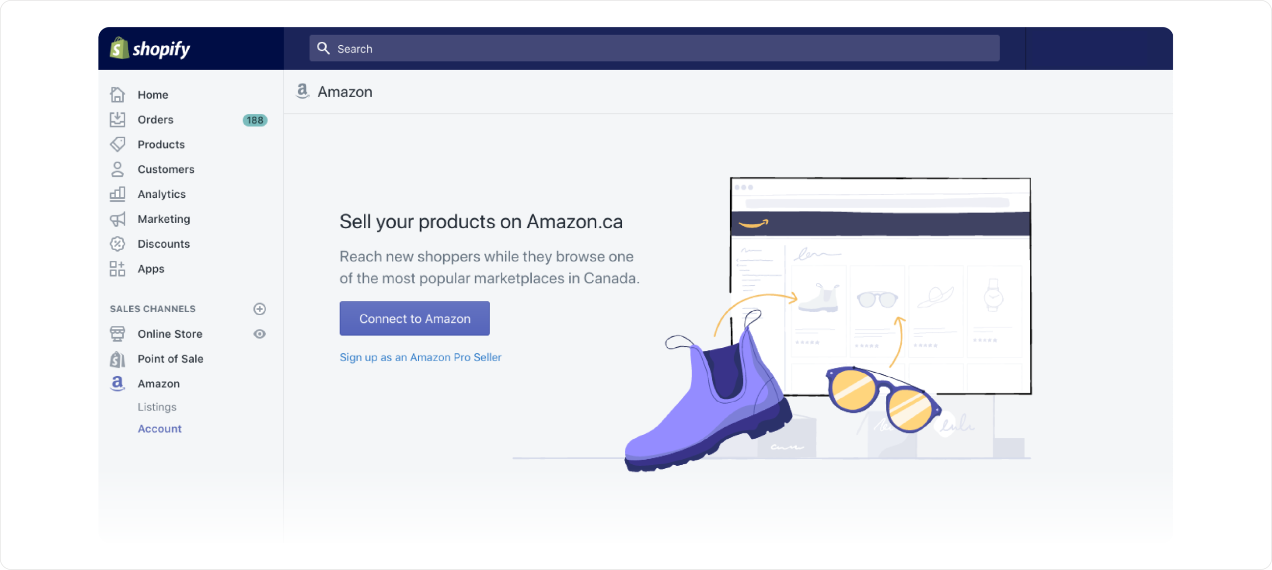
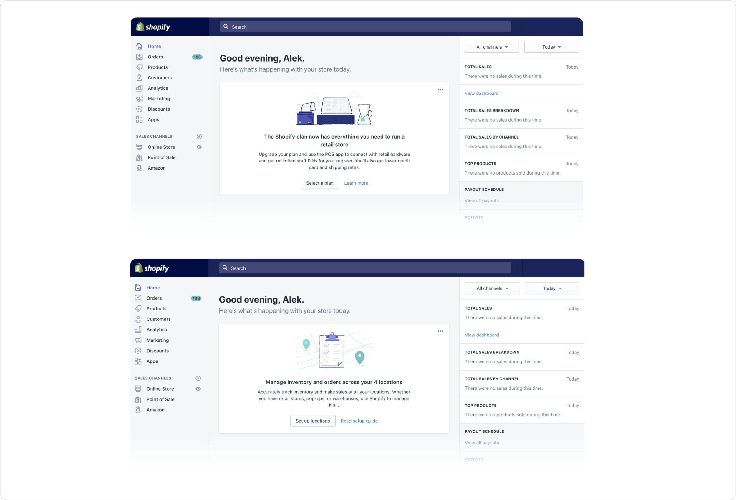
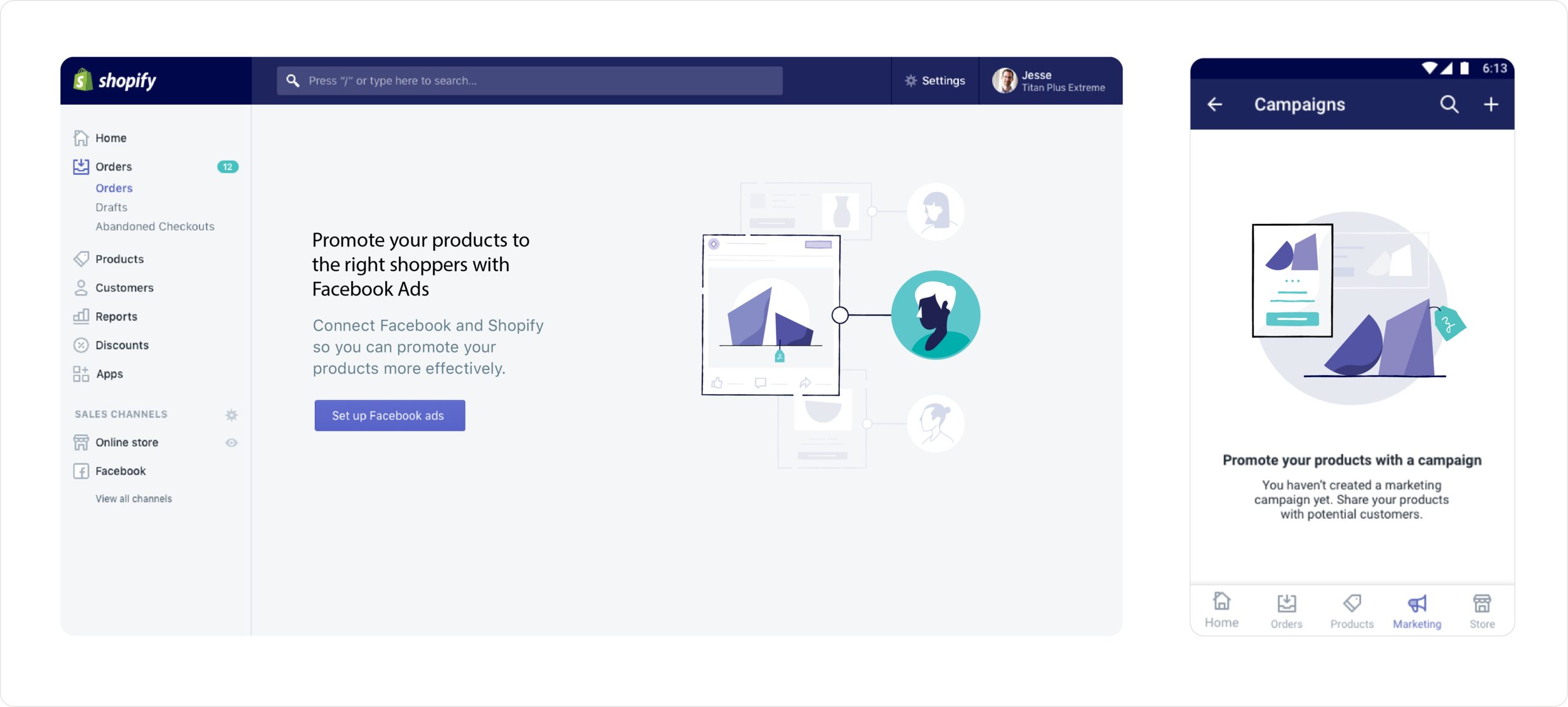
The vision was to have one cohesive illustration style that flexed across all of Shopify’s experiences. Core elements of the style would act as the shared “family traits”, and would be expressed across all illustrations regardless of their purpose or messaging or context. But the level of expressiveness, composition, and conceptual choices for each illustration changed depending on the kind of communication that was necessary for the particular experience.
Celebratory or motivational moments could be wilder and more colourful, while more serious, task-oriented moments would be more appropriately supported with subdued and literal imagery.
Evolving the system
As senior leadership began to form new opinions and directions for the future of Shopify’s brand and product, we began to gradually explore and reflect these changing ideas in the work we were shipping.
The role shifted into involving more creative direction during this time, as we continued collaborating with product teams and had to introduce them to new ways of thinking about how Shopify’s brand should be reflected in digital experiences and the illustrations within them.
Building on a new vision
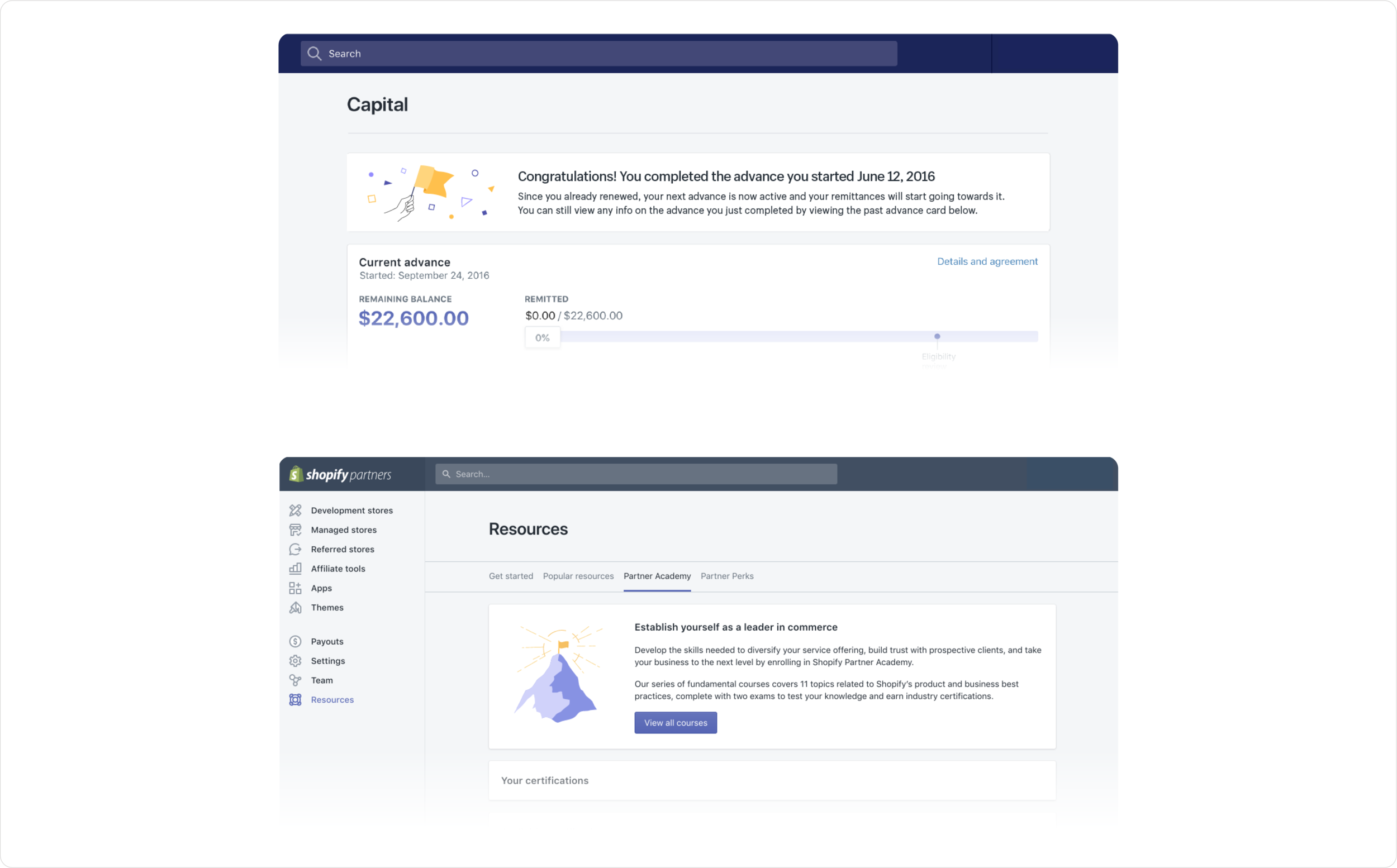
Bit by bit, the one highly expressive, character-driven and often humorous illustration style changed into something much more literal, professional and instructive. It was a sign of things to come—of a Shopify ripe for change—and we were on the frontlines of exploring and representing it.
We were also trying to connect with the ever-growing variety of merchants selling on Shopify. Representations of products commonly sold by major business verticals like shoes and bags weren’t very relevant to wider ranges of merchants. So we explored representing products more abstractly, with geometric shapes and symbols.
Results
Ultimately, our team produced over 300 unique illustrations across countless marketing and product experiences in an initiative that spanned a few years of fluid and multidisciplinary work. Shopify grew exponentially, from 200,000 to over 1 million merchants using the platform during this time.
The illustration style deeply influenced the industry in general, sprouting many other companies to borrow design cues from it. It also served as a framework for foundational learnings about Shopify’s visual brand that would be applied in the major redesign that soon followed.

