
Shopify Polaris for Retail
Role:
Technical illustration • Icons • Visual design • Art direction • Project management • Peer mentorship
Team:
Ricardo Vazquez • Tobias Negele • Erin Moncrieff • Greg Moore
Tools:
Adobe Suite • Figma • Slack
After a few years of Shopify POS strongly aligning to the Polaris design system in use across Admin and Mobile experiences, it was time for it to branch off and establish a local design system of its own to better solve the more nuanced kinds of problems that physical retail merchants are facing.
Our broad goals for the experience were:
Accessible for all. Whether a merchant is in a brightly lit environment, or a dimly lit environment, distracted by noise, or other conversations, or dealing with personal accessibility challenges themselves, the product needs to account for these variables and empower merchants to be focused and efficient.
Pragmatic, no nonsense. POS previously aligned with the Admin’s goals of creating a lighthearted and delightful feeling experience. While this could feel welcome in a private, back office environment, it felt inappropriate in a front-of-house professional setting dealing with clients and purchases.
Fast, reliable and simple. All design decisions would be benchmarked against these three principles. Merchants processing hundreds of orders a day in complex and busy physical environments need a product that performs swiftly, intuitively and predictably in order to best empower their business’ success and personal wellbeing.
Icon system: ideating and prototyping
At the time, Shopify’s Polaris Icons were quite soft and rounded. They were intended to feel friendly, delightful and not attract too much attention while still satisfying their purpose of helping merchants parse information-dense experiences quickly.
After some exploration and assessment of different style treatments, we landed on filled icons performing best on the dark surfaces of the experiences. Outlined icons were more difficult to recognize at a glance on the dominantly dark surfaces. Filled icons felt much more tactile and tappable—important qualities for a touchscreen experience. Though this redesign would focus on a dark interface, a Light Mode could be a possibility for the future, so the icons also needed to be future-proofed to perform well on light surfaces.
Our trials also led us towards adopting a style with slightly rounded corners. Sharp enough to stand out and appear crisp at a variety of different sizes, but not so sharp that they come across as harsh.

Icon system: scaling
After finalizing a base set of style guidelines, I set about determining the different icon sizes required for each context that they would be used in. In order to optimize for optical balance between each icon and with its corresponding text, and to maintain strong ease of recognizability across all sizes, our design decisions around exactly how much spacing there should be between elements, and the radii of corners was determined to ensure each icon could be scaled up or down as necessary to meet the needs of different contexts.

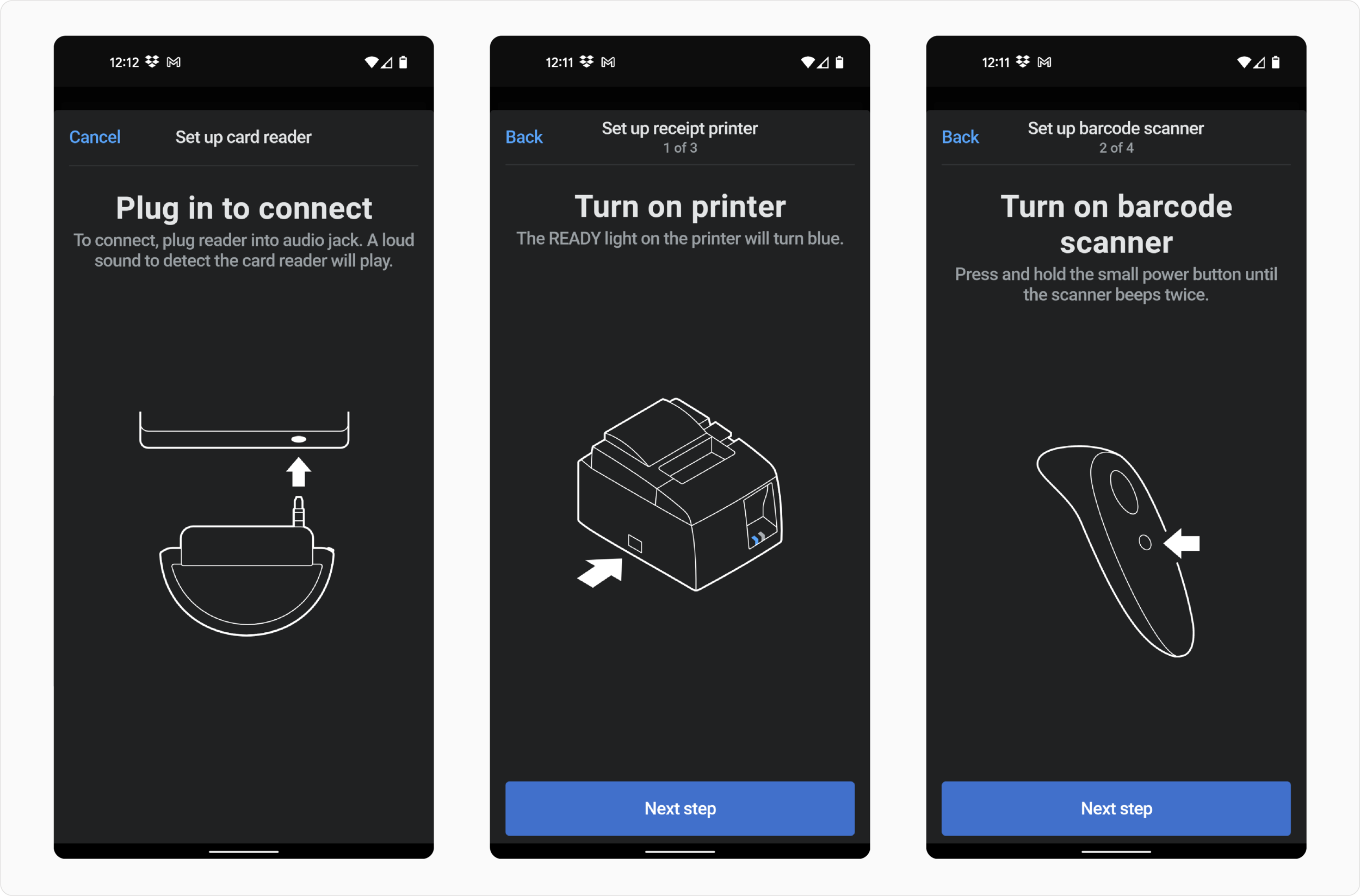
Technical illustration: the opportunity
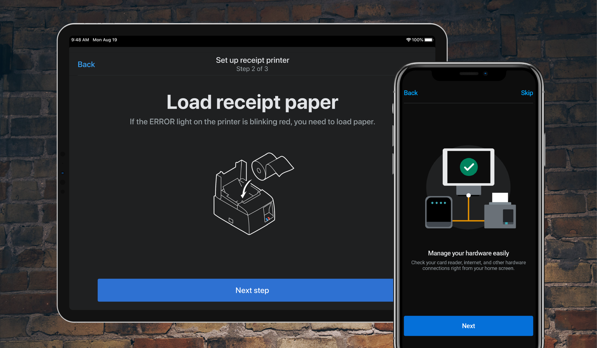
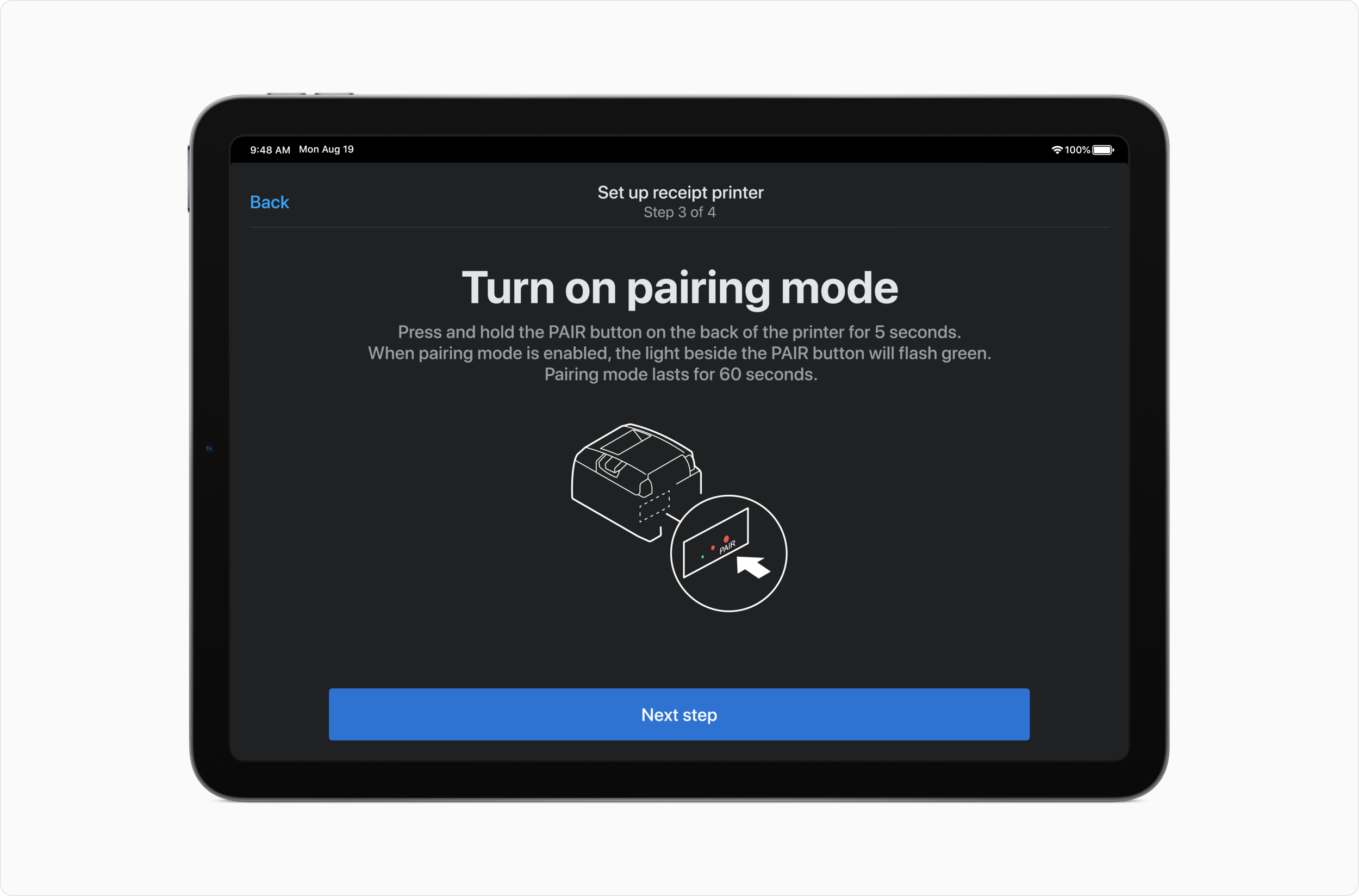
Shopify POS interfaces with many different pieces of hardware that support merchants to easily and seamlessly do what they need to do. Things like barcode scanners, printers, and cash registers.
It can be stressful to set these things up, depending on what’s happening around you in your store, or how comfortable you are with operating technical devices.
To best support merchants in these onboarding experiences, we created a technical illustration system to provide clear visual communication across each step in the processes. Supported by written content, each illustration, sometimes with subtle animation, could bring clarity to what otherwise could be a very confusing and frustrating task for merchants. Moreover, abundantly clear in-context help in these situations would reduce support debt.
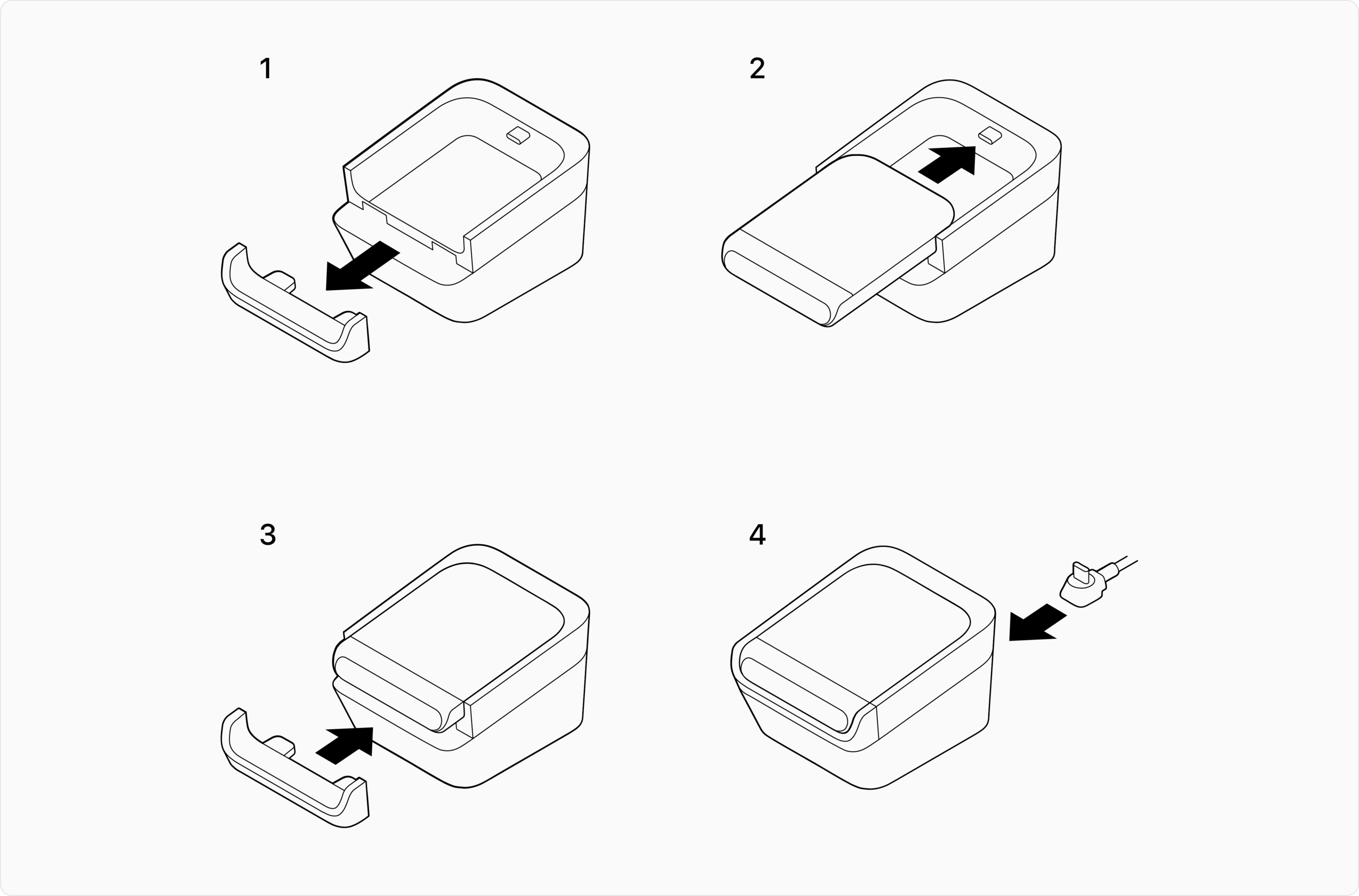
Technical illustration: foundations
I began by investigating technical illustration from other companies and industries to identify the kinds of details that would lend themselves best to the experiences we were building. From there, I defined a series of principles: Clarity, Continuity, and Accuracy. These principles would guide our decision making around what kinds of angles of the devices we should render, what details to surface and how to indicate actions and features of importance.
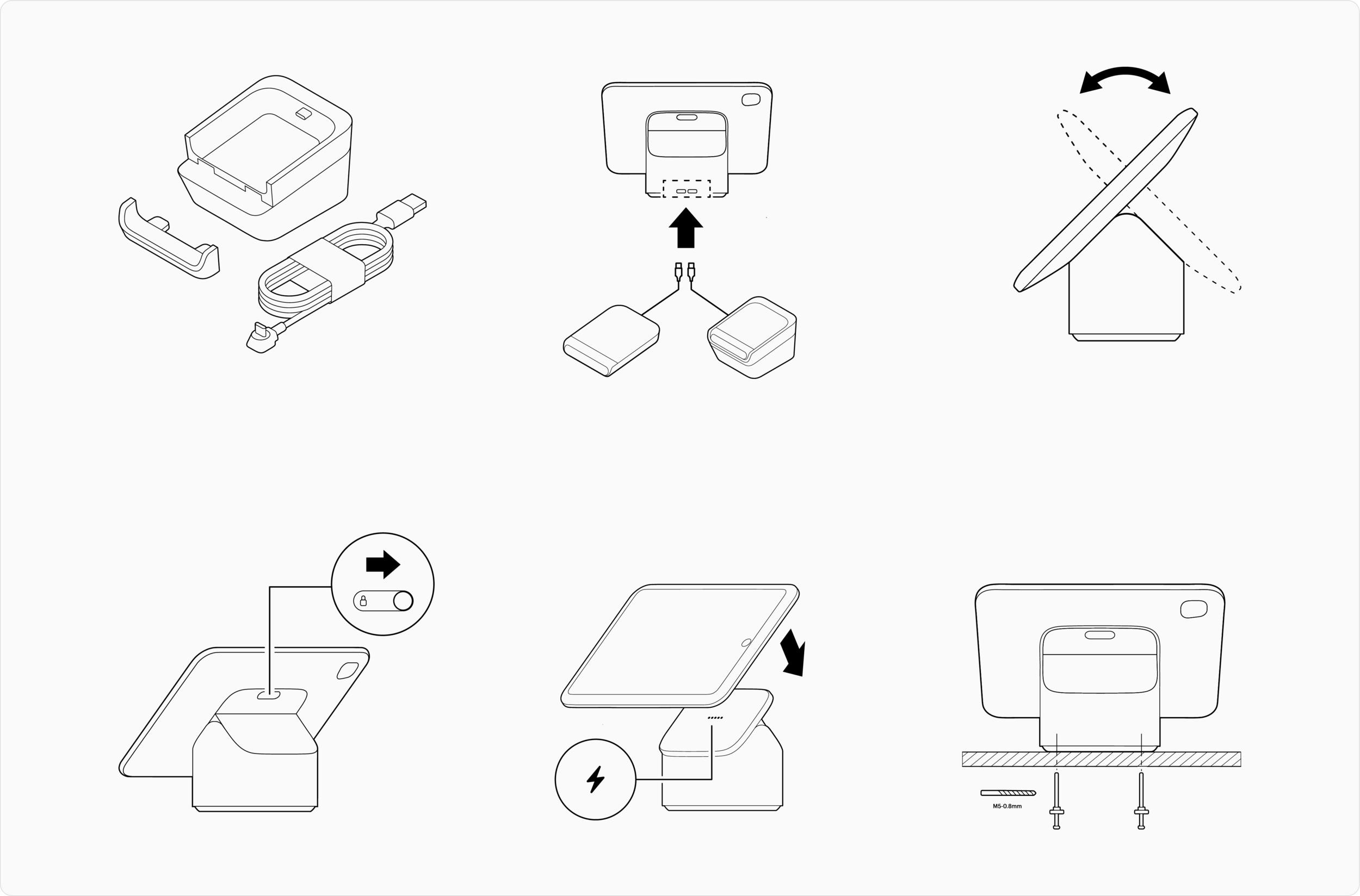
Technical illustration: process
Pairing with another illustrator, Erin, I created a burndown list of each state that needed illustration support, and populated it in a collaborative Figma document that we could both work in simultaneously to best maintain alignment across all the illustrations. We worked through each state and had regular check ins for feedback with stakeholders to ensure the work was aligning with overall expectations and goals for the experiences., and responding to all the other changes happening to the experiences simultaneously.
Results
Overall, we shipped 24 technical illustrations and 35 icons to serve the initial launch of the Shopify POS redesign and lay the foundation for the product team to continue building on and evolving the system over time. The redesign received very positive merchant feedback. The technical illustration style has continued to evolve and play a role in physical print, marketing and other digital experience applications.